


An overarching trend we see for the upcoming year is an increased sense of playfulness in web design.
Check out our latest post: 11 engaging web design trends for 2023.
Designers have started creating sites as art, sites as interactive projects, and sites that simply exist for play and delight. This harkens back to the beginning of the web when designers found ways to show off new techniques or create websites for their own sake.
We seem to be in a bit of a renaissance period of the early web. It makes sense. Fashion has also been borrowing heavily from the late 90s and early aughts. Many of us have been spending time at home idly surfing the internet, looking for something diverting or exciting like we used to do when the web was first emerging.
Visually, web trends are taking cues from that era. Designers are finding creativity outside of the more photograph-centric layouts that have become standard. Instead, these designs find creative ways to use typography, grids and lines, and simple navigation. Updated styling — with a lot of muted colors, sophisticated textures, and serif fonts — keeps sites from feeling too retro.
Web design is also moving into the future with exciting contemporary techniques like advanced interactions and animations and visual effects like glassmorphism and grain. And designers are using no-code tools to enable them to do it all faster and easier than ever before.
2022 web design trends
Here are some of the trends in web design we anticipate making an impact in the upcoming year.
1. Mini-sites of delight
Humor can take many forms, and a website that provokes a laugh is always fun to build. Why not have some fun with your build?
In the early days of Pixar, the studio began giving animators time to make a short film alongside every feature film they produced. These shorts were a creative free-for-all, a time for animators to be looser and more playful without the pressure involved in their feature films. They also ended up generating a lot of new techniques that pushed the field of animation forward. Web developers are discovering they can do the same with websites.

Crafting a fun mini-site gives designers time to just be creative, to practice and experiment with techniques, and to pull out all the design stops without worrying about going overboard on a professional gig. Sometimes creation for creation’s sake is a great way to get out of a rut.
You can experiment in a number of ways: by setting an intentionally playful UX design, or deliberately subverting expectations (but make sure you still build accessibly!). Bring humor into not just the copy and images but into the site navigation, menus, and interactions. Be subtle. Make it seem like it’s a serious site until it’s not. This is an opportunity to create a site that functions in unexpected ways. An Easter-egg-style marketing site for a professional purpose can work if it’s executed well.
Guns 2 Swords is a mini-site/enterprise in full ‘80s Dungeons & Dragons glory, with a taste of Choose Your Own Adventure. It was created by MSCHF, a group that is somewhere between gonzo artists and hype app creators, to be an actual service. Visitors could send their guns in to be forged into swords by a world-class blacksmith. Truly epic.

Blue Check Homes took the opposite approach of creating a fully legit-looking “serious” website. What started as a Twitter joke by Danielle Baskin might end up becoming a real mini-business selling “blue check” medallions (like those on verified Twitter accounts) for the homes of notable individuals.

2. Web-based scavenger hunts
Websites’ structures actually lend themselves to puzzles and scavenger hunts incredibly well. You can daisy-chain pages and password-protect certain parts, making visitors provide answers or find clues to unlock the next page in the series.
There are all sorts of creative ways to conceal and reveal prompts, clues, and answers. This is a case where you can use your web design prowess to create a puzzle that enthralls.
Some ideas for clues:
- Provide a word based on a riddle or clue
- Find a word hidden in your main site or the scavenger hunt site
- Find a hidden clickable element on the page
- Draw a shape
- Decode a cipher
Just remember to give your audience some sort of hints or workarounds if you really want everyone to be able to make it to the end. A scavenger hunt can be used to reveal a product launch, release a new video, or give the viewer a hidden piece of information.
Marketing agency ThreeSixtyEight made a scavenger hunt to reveal the location of its company retreat to its team. It created a mysterious atmosphere with music and an opacity adjustment around the cursor that a visitor can use to reveal selective parts of the page while hunting for clues.

3. App-like experiences
Jeremy Beyt, co-founder of ThreeSixtyEight, strongly believes these sorts of smaller, experience-focused sites are the future of web design. He explains: “A front-end-driven web experience that’s really overblown from a design standpoint is a whole new way of using the web that hasn’t existed before; it's an app-like experience. That, to me, is the opportunity right now.” The world has gotten used to apps, where interaction, animation, and dynamic experiences are the norm. The logical next step is bringing that energy to websites and creating more unique experiences there.
Some imagine we’re headed back to times where sites were self-contained, esoteric, and curious. But new tools for site building, such as no-code, make dynamic, interaction-focused designs significantly easier to build. ThreeSixtyEight even added a full interaction-design-focused step to its development process.
4. One-page websites
Sometimes the most effective site is the least complex one. We have seen the increasing popularity of the one-page website that forgoes menus and navigation in favor of simple scroll navigation. One-page sites work best when their subject matter is narrower, like a portfolio or the presentation of a single idea.
These sites evoke the feeling of holding a flyer or reading a poster. All the information you need to review is in one place without the distraction of navigation or searching multiple pages.
This website for Indi Harris (built by Jordan Hughes) is a digital resume. It lets its subject be the focus of attention. This makes it more likely that a casual viewer will read the entire resume since everything they need is right up front.

Joshua Kaplan’s portfolio site is more complex but just as effective. He uses a consistent structure so that the viewer doesn’t get lost, reduces distracting elements (no background, big images, or movement), and makes his site feel a little retro-web with the linework and throwback copyright symbol logo.

5. Sites with a strong sense of place
Maybe we are all just compensating for missing travel, but some websites seem to be gaining more sense of place. We are seeing photographs of locales featured on homepages and about sections calling attention to cities, towns, and natural places around where the creators live.
The web can be a detached place where you often have no connection to where the site you’re browsing is coming from. Adding a note like “made with love in ...” or featuring an image of your favorite nearby spot prompts visitors to picture where you are and creates a small real-world connection for them. If we have been traveling less, at least we can remember we are making connections all over the world online.
Grace Potter uses this beautiful ocean image as her landing page, even though it isn’t directly related to her work. With this photograph, she grounds her website in her New Zealand roots, bringing the visitor into her world.

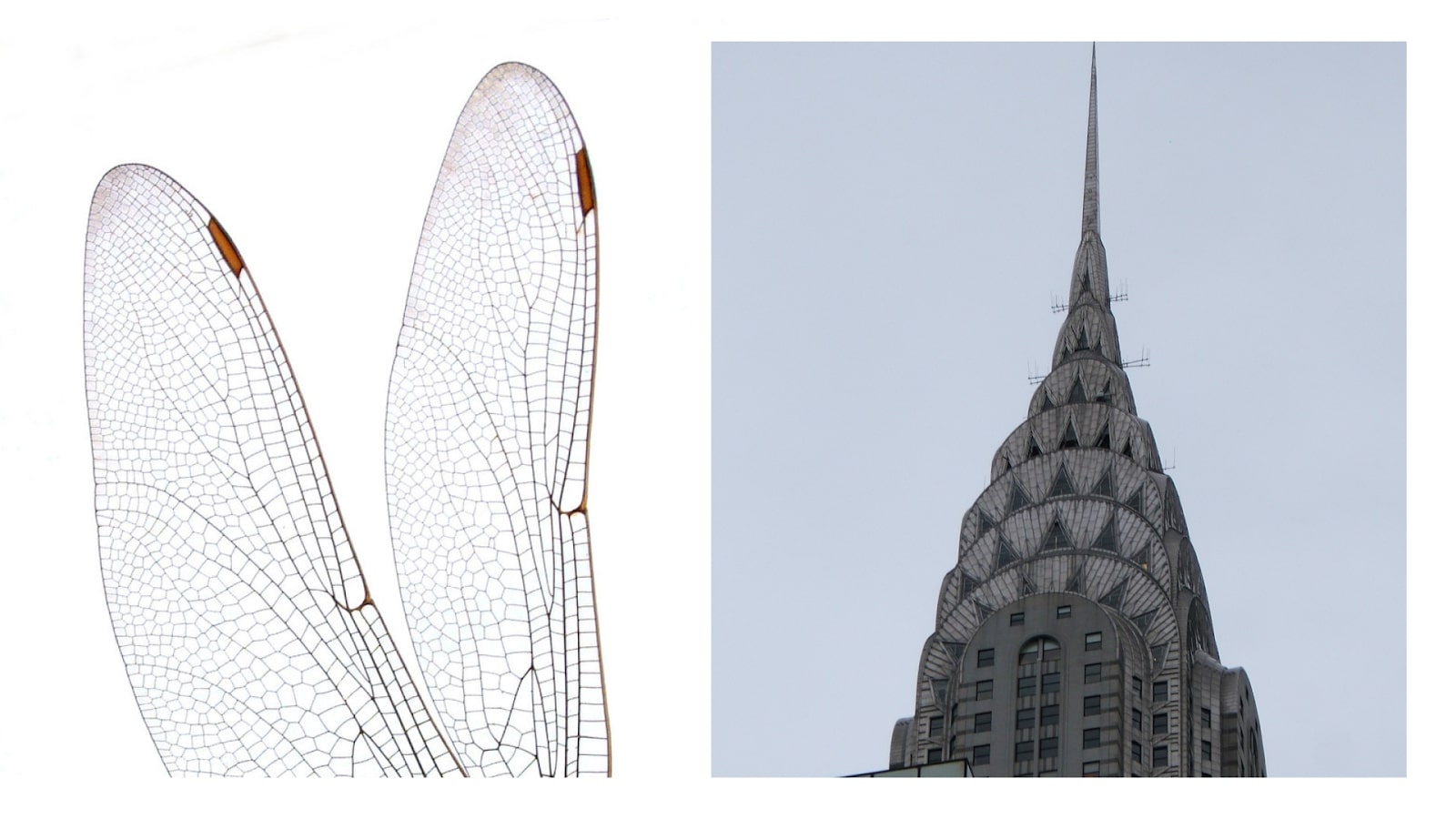
6. Art deco motifs
We are in the ‘20s again, after all! Art deco motifs fit well with the geometric designs that have been trending over the past few years. Though people’s first association with art deco style might be ornate speakeasy sites and Gatsby-themed wedding invites, it can make for beautifully minimalist designs.
This year’s trend takes inspiration from the clean, curving lines and repetitive graphic shapes of art deco illustration and architecture. These elements can inspire beautiful logos, fonts, spacer motifs, borders, and illustrations. To effectively design in this style, it helps to understand the philosophy behind the original art deco movement.
Art deco combined elements from the natural world with the modernity of the machine age — bold lines, symmetry, simplicity, and unvaried repetition of elements. See how the shapes in this dragonfly wing translate to the regular patterns of the classical art deco Chrysler Building.
The Alegria art style that BUCK designed for Facebook in 2017 appears to take a lot of cues from art deco’s depiction of human figures. The clean, curving lines, oval faces, reduced detail, and exaggerated proportions all call to mind this art style. Perhaps a new type of modernist figure design, like this stunning piece by illustrator Rodolfo Reyes, could be an updated version of this trend.

7. Fewer images in heroes
This year, many designers are opting to craft hero sections and landing pages that speak with design rather than relying on photographs or illustrations. Hero images give a big visual impact right off the bat, but sometimes eliminating the distraction of a splashy image puts the focus more on style and content.
These four websites from Humain, SVZ, Heyday, and RADAR are incredibly different, but each uses layout, typography, color, and shape to communicate strong, unique brand identity. Forgoing images also creates a bit of mystery, enticing visitors to find out what else lies beyond the hero section.


8. Oversized typography
Typography of unusual size is a fresh, bold design trend for this year. At a certain size, words become more of a graphic element than simply part of the copy. This is a versatile technique that can be used in minimalist or maximalist designs just as effectively and can suit many different styles.
This film portfolio website for Eva Habermann (made by Daniel Spatzek) overlays large text onto a moving film portfolio reel. The text partially blocks the image, making the viewer curious to see more, and a sans-serif font in two colors gives just the right amount of contrast without being illegible or overwhelming.

David Calle’s portfolio site uses oversized text to create a sophisticated, ultra-minimalist design. The neutral background color and serif font combine beautifully with subtle animated movement as the viewer scrolls.

9. Interactive fonts
Taking the use of text even further, some designers have been finding creative ways to make their text move and play with the user’s mouse. An easy way to make text interactive is by applying a hover-state change like you would with a button. It helps that it’s now easier to create more elaborate effects using modern no-code platforms than it used to be to try to write these interactions by hand. When employing interactivity onto fonts, it’s important to keep legibility in mind as some people are distracted by moving characters.
The website for Dillinger uses a font that changes weight when the cursor hovers over the text. Note that the text shrinking against the black background makes the selected text more legible, a great addition for usability. The exaggerated cursor size also makes the site feel more immersive. Designer Tim Ricks was kind enough to make a cloneable version of this site for anyone who wants to see how the effect was created.

10. Responsible motion design
Now that we’re talking about interactivity, it’s time to talk about responsible motion design, which we see starting to become a standard practice. While movement is an intriguing facet of web design, it’s easy to not just go overboard, but also cause harm to people by causing motion sickness. Motion sickness is quite common, and animation like mouse-triggered scaling, parallax effects, or plane-shifted scrolling (also known as scrolljacking) should be avoided.
Motion can be used in subtle ways and responsibly. Corey Moen, a Senior Brand Designer at Webflow went into detail about how to build while taking into account the ‘Reduce motion’ setting in MacOS.
And while that’s important, it doesn’t mean you should use this as a catch-all and an excuse to use motion all over the place. Excessive motion is a confusing user experience, harmful to many, and simply not necessary.
Related tutorial: How to build for those who prefer motion and those who don't
11. Collage illustration
Collage style graphics can give site illustrations a tactile feel, open up more white space in a design, and allow you to incorporate images without focusing the entire design around a photograph. Make sure you mix up shapes, patterns, and colors within a collage. You can add a monochrome effect, tint, or filter to photographs to help them blend with the overall design.
Vanta’s site uses collage-style illustrations on the landing page and throughout the site. Editing its photographs for a collage-like appearance allows it to place graphics irregularly and off-axis, breaking up the site’s grid

Use Webflow's visual development platform to build completely custom, production-ready websites — or high-fidelity prototypes — without writing a line of code.
Use Webflow's visual development platform to build completely custom, production-ready websites — or high-fidelity prototypes — without writing a line of code.
12. Abstract illustrations
Abstract illustrations that have a more organic texture and a sense of the human hand creating them are becoming more popular. While clean, poppy vector graphics and cute illustrations of humans and objects have ruled web design for a few years now, perhaps people are looking for something that feels a little more natural and sophisticated.
This sort of illustration can be created with ink and paper and scanned or created in illustration software. The key is incorporating various textures and natural irregularities like watercolor, ink, paint, silkscreen effects, or the texture of the paper. Lines can also be softer, mimicking variations in line weight that come from using graphite or ink.
Abstract doesn’t have to mean simple! These blog post illustrations by designer Adam Ho are a perfect example. Look at the curious complexities of his designs. With their ultra-thin lines and graphic shapes, they feel like they could be technical drawings without directly representing any specific object.

13. Gradients with grain
Gradients are already popular, but with added grain, they create an entirely different effect. A perfect gradient is slick and modern, giving objects a futuristic glow or a shiny, technological feeling. Grain grounds a design, gives it texture, and helps it feel more natural.
Depending on the treatment, grain can mimic film, photography, or print mediums. A fine, multi-color grain can look like analog film, while a larger monochrome grain can look like a silk screened poster. Grain and gradients that incorporate it can be used selectively or across the whole page, as a full background, or within specific objects.
We used a number of grainy gradients on the website for the Webflow 2021 No-Code Conference. Gradients are used in animated graphics, backgrounds, and elements all over the conference page, and we chose a mid-size grain that gives a print-media type effect.

Another creative use of gradients this year is issuing them within the borders of buttons and other types of elements. Here’s a tutorial for creating the following rainbow-bordered button.

14. Linework
A trend that feels in some ways both modern and throwback is linework. Designers can use lines to delineate sections, headers, paragraphs, and product galleries, or create a dynamic grid for the entire webpage. Add linework illustrations (abstract or representational) to bring this style even further. With this type of design, line weight is going to have the biggest impact on the final effect.
Appart Agency’s website uses ultrafine lines. The effect is technical, sharp, and minimalist. The graphic design and orange, black and taupe color selection recall the Minimalist art movement of the 1960s. The motion of the horizontal lines on scroll is also a nice touch.

Breef uses thin lines too, but combines them with lighter typefaces and illustrative graphic elements. With the muted color palette and strikethrough mouseover feature, the overall effect is casual, in a grown-up millennial type way. Its site has a lot of information to communicate, and the clear section divisions, illustrations, and unfussy background help the content stand out.

CPGD uses bold black lines for a fantastically graphic effect. This design has more of a young, fun feeling. Each section within the lined grid is a different color, helping differentiate content, and the mouseover color change orients the user as well.

15. Split-screen websites
An interesting way to break up a design is with a split-screen layout, which we have been noticing more recently. The dual layout gives your design contrast, visual interest, and natural separation of content. It’s also a great excuse to play with color.

var!-būt!'s festival website (built by ONEIGHT7) puts an interesting spin on this design with a fixed footer, marquee scroll, and contrasting scroll directions on the right and left sections. The split-screen here anchors the viewer so you can incorporate lots of movement without them getting lost.

16. More glassmorphism
A gorgeous trend for this year is glassmorphism. A combination of transparency, blur, and movement can make elements of pages behave visually like glass. You can use this technique in logos, illustrations, or even full sections. There’s a fantastic tutorial by Tim Ricks on one way to create a glassmorphism effect here.
The key to this style is diffusion, reflection, and shadow, which create the optical illusion. Combined with subtle movement, the glass effect can make a site feel 3D. The diffusion of the “frosted glass” within the image allows you to incorporate transparency into your design without it feeling too visually messy.
Tyler Galpin uses glassmorphism to create a mesmerizing logo with movement.

Stefan Velikov uses glassmorphism in this cloneable Webflow project to make this credit card illustration hover and pop off the page.

17. Less neumorphism
Neumorphism, a new interpretation of skeuomorphism in design, is a minimalist style that started getting popular for apps and websites in 2020. It mimics modern device design — think of a new style remote or older iPod — by using low contrast monochrome elements, subtle shadows, and forgoing lines and sharp borders. Here’s an example from Dribble:

Neumorphism sticks out because it’s different from most web designs, but sometimes things are built in a standard way because it just works better. The reason we picked “less neumorphism” as a trend is simple — the style is terrible for accessibility.
The lack of contrast and clear differentiation makes sites in this style very hard to navigate for anyone with reduced vision, and the shadowed elements make it hard for the user to tell which button they are pressing. The CDC puts the number of Americans with vision impairments at more than 3.22 million, but accessible design isn’t just important for those with disabilities. Everyone will encounter situational vision difficulties at some point, like bright environments that interfere with screen visibility, and neumorphism is hard to read in environments like that.
Fifty-three million people in the US alone live with disabilities, and everyone experiences situational disabilities at some point in time. Accessibility is much more than a trend — it is a necessity and should always be a top consideration when designing for the web.
18. Inclusive copy
We have noticed a lot more websites moving toward inclusive content and language in their designs. This should be a norm, and hopefully, this is a permanent shift toward a more universal awareness of the impact of language. More inclusive copy makes the web a place that is more welcoming and more accessible to more people.
Webflow has our own reference for inclusive language that we use to guide all our written output, and we have made it publicly available as part of our brand design system page. Language guidelines can be a useful feature to add to any company website.
It’s not just what you say, it’s also how and where you say it. Alt text, legible text (font, size, and color), and avoiding text-as-image are all ways of making sure everyone will be able to read what your site has to say, regardless of language or ability.
19. Gender-neutral design
Another approach that we see becoming a standard is gender-neutral web design, which we already see being adopted more universally. The obvious first step is opting out of the unnecessarily gendered details that used to be so ubiquitous — aggressively pink personal care sites or hypermasculine fire-wolves-and-knives themes for camping equipment. Women buy power tools and men buy skincare, but it’s easy to default to societal assumptions without thinking.
It has become standard to offer multiple gender options and pronouns in forms and drop-down menus. 42% percent of Americans now think multiple options should be included. Better yet, when websites don’t have a pressing need to include those options, they can take both out completely, as Snapchat has opted to.
.jpg)
When writing copy, the new standard is to opt for they rather than he or she when a gender is not specified. Even in ecommerce, many sites are becoming more inclusive by opting not to sort clothes by gender or by offering multiple sizing systems and modeled shots on various bodies to make their products more accessible.
Avoid assuming the following about the people who might use your website: what their genders might be, and what they will be interested in because of their gender. Avoiding these assumptions is more respectful, and will be appreciated by your visitors.
20. Page speed prioritization
On the technical side, page speed has become a front-of-mind consideration for web developers this year. Google’s 2021 algorithm update makes speed a more important consideration than before for SEO. This also reflects users’ higher expectations for site speed performance since 53% of users will abandon a page that takes more than 3 seconds to load. Gone are the days of patiently waiting on loading screens.
Google PageSpeed Insights or Lighthouse are tools that can be used to assess your page speed optimization. There are also a few simple steps developers (or their platform of choice) can take to make sure pages load quickly like image optimization and deferred offscreen image loading. Limiting how many fonts you are using can help as well. You also want to avoid developing your pages on a platform that relies too heavily on plug-ins since that can have a big impact.
21. Building with dynamic content
Dynamic content allows designers to build faster, build bigger, and include more complexity without increasing the amount of labor required to make adjustments. More available database tools and no-code platforms mean more people designing for the web can begin building this way, no matter their experience level. This is a significantly more efficient way of building for the web, and it’s becoming much more widely adopted.
Dynamic content is built around a database linked to repeated structures. The structure can be changed in one place, and you can simultaneously change all your blog posts, for example, without having to manually adjust each one. This is great for anyone building a site with content that is constantly changing — like ecommerce, blogs, portfolios, restaurant menus, or news sites.
Static content will still have some uses, but building with dynamic content is taking over the web.
22. No-code being used for more teams
We are seeing more and more teams incorporating no-code into their workflows and benefiting from the speed and independence it gives them. No-code has grown into a movement, empowering citizen creators to build for the web without having to have coding experience. Your team is probably already using a multitude of no-code tools to make their work more efficient.
For businesses, this means more teams can create web assets for their company. HR departments can create training sites, resource repositories, or company directories. Design teams can make working prototypes or craft design systems that can be referenced by anyone across the company. Marketing can contribute directly to the parts of the site they use to connect with customers or even create microsites for specific campaigns or smaller regional initiatives.
The independence offered by no-code opens up more opportunities for innovation and experimentation and helps teams work a lot more quickly. We expect to see many more businesses incorporating no-code tools into their day-to-day workflows in a more significant way this year.
We are excited to see how these get put into action in 2022
We enjoyed navigating the sites that inspired this list so much. We anticipate a year of playfulness and creative revisioning as designers move away from some of the trends that have become so ubiquitous over the past few years. We can’t wait to see what you all create for the web in 2022.
Check out the 2023 edition, 11 engaging web design trends for 2023, or take a trip back in time and check out web design trends from 2021, 2020, 2019, 2018, 2017, and 2016.


